I used to be THE culprit of kitsch when I started out. I wanted my college apartment bedroom to feel like a conservatory, so up went a huge painting of a conservatory & palms & a whole dollar store's worth of fake flowers along with it. eesh (I've mentioned this room before & still haven't found a picture of it- my albums are in storage!)


Using materials & details that would possibly be used in a true farmhouse make this space authentic. The cow print is a fun playful addition to the room & it's not trying to be anything more than it is. The white ironstone is appropriate & beautiful.

Anyway, since kitsch is often one of the easiest & cheapest things to do and one of the most readily available, we see it a lot in real life. Picture the person who wants their house to feel like a farmhouse so they buy farmhouse dinnerware:

When instead they could do something more authentic, like this home from Country Living, below:

Using materials & details that would possibly be used in a true farmhouse make this space authentic. The cow print is a fun playful addition to the room & it's not trying to be anything more than it is. The white ironstone is appropriate & beautiful.

Or picture the person who wants a Tuscan-feeling kitchen & fills it with an unusable amount of bottles of oil in the kitchen,

or dishcloths with winebottles on them, wine bottle artwork and throw in a mass-produced Tuscan scene or two. Now I do not mean to judge here, merely to get us thinking. I have been the culprit of this many a time. I think it's a really easy way of designing to get into for the inexperienced & I've SO been there. (how do you think I can describe this room so perectly?! ;)


But the interesting thing is how to figure out how we can evolve out of it, to figure out ways to create the spaces we desire without being inauthentic. To really evolve & become better. I like this styled buffet from Pottery Barn, below. It gives the Tuscan feeling without being as obvious:

Why show a picture of a bottle of wine with no intrinsic artistic value when you can simply have a wine rack? (This isn't to say that I think art with wine in it can't be beautiful, because I've actually very recently seen some amazing art with wine bottles in it) And, why have a picture of a potted palm when you can just head to Home Depot & grab a real one? (yeah, I know, you have to keep it alive ;) And I'm not talking about botanical prints of palms (which I love & I do think of as authentic), I'm talking about the early 90s looking artwork:

If you have stuff like this home, don't feel bad. Just maybe take a minute to reevaluate it. Ask yourself if you actually love the piece or if you just picked it up because it was inexpensive & came in 4' by 3' & fit the "theme" and in the blank space above the sofa. If those are your reasons, I'd say ditch it. If you actually look at it & do love it, then work with it. Thomas Kinkade (below) is one of America's top-selling painters & his name is also one of the first that pops up when you google "kitsch art." A lot of people love his work & the happy feeling it gives them. I say that if you really love something even if it is considered inauthentic, then keep it. If you love it, it's authentic to you.

I also do think it's possible to be ok with certain aspects of kitsch. For example, check out this space in decorator Kirsten Hollister's kitchen (below image from turquoisechic.com) where she uses a bunch of kitschy little paintings of flowers & groups them together casually, irreverently & has fun with them. She's using them for the pops of color & fun they add to the room and it's not displayed as precious art:

And I totally have a thing for really cheap old paintings of landscapes, boats, people & the water. I get them for around $5- $30 & I absolutely love them. I know they're not great art and are considered kitsch, but something about them makes me happy. I think the key is to just display them casually or en masse. The way you display art says a lot about it. (Is it lit up & in a $400 frame? Then that baby better be art in your eyes!) Image below from interiordec.about.com:

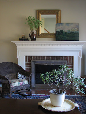
Here's a $5 cheapie I love (below) that I have on my mom's mantle right now. It's just causually leaning there & it's not a permanent fixture. It doesn't speak to me in any profound way, it simply added the color & feeling I was on the mood for in the room. It's more to create atmosphere than to be gazed upon as a work of art.

On this road also comes the fabric question. There are those who say that flowers belong in vases & not on fabrics. I really do see the logic & realness to this idea, but I'm still not there yet. I still love a pretty floral on a pillow or blanket. (I'll write more on this later)

One thing I am learning through all of this is that I don't believe in absolutes when it comes to design. Make your rules, but if something comes along & doesn't jive with your rules & you're okay with that, break 'em! I just think it's important to be aware of why you're making certain decisions & to be aware of why you're breaking the rules.

("They're more like guidelines anyway." ;)
0 comments:
Post a Comment