Lauren mentioned that her readers like "before and after" posts, so I thought I would share my kitchen update with you.
When my husband, Steve and I first built our home, we decided to use simple, classic materials in our kitchen. We selected white subway tiles for the kitchen backsplash and Carerra marble slabs for our kitchen counters. We knew that we would be less likely to get tired of these materials and could always give our kitchen a little freshening up by doing a few cheaper cosmetic changes. Well, it's been almost 8 years since we built our house, and Steve and I felt that it was time for an update.
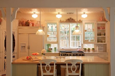
This is how our kitchen looked for the past 8 years. All of our kitchen accessories were pink and green. Our kitchen island was a minty green that complimented our green glass knobs and plates.
We used two white Holophane lights over the island, and two Pottery Barn barstools for seating.
A Victorian style screen door was used for the pantry.
In the past 8 years our style has gotten a little more neutral and less floral. Steve also wanted our home to feel a bit more masculine. He asked if we could add a few industrial elements into the mix as well. Would it be possible to update our kitchen to reflect our changing style without tearing the whole place apart?
Here's what we did....
1. I replaced my floral curtain under my sink with a natural linen. I used my favorite linen: Hinson's Luxembourg Linen in Natural.
2. I gave my green glass knobs to a friend who was re-doing her kitchen! In their place I purchased these from Restoration Hardware (in satin nickel):
The Ephram is a classic egg shaped knob.
The Ephram Pull is clean and simple without feeling too modern.
3. Potted herbs and my old cutting boards added color and warmth.
4. An old wood sign replaced the floral print above the sink.
5. I put all of my green and pink plates away in my cabinets and brought out my white plates, old trophies and hotel silver for display on my open shelves.
6. To add a bit of an industrial feel, we painted our Holophane lights silver and...
7. We replaced our Pottery Barn stools with these medical stools from here.
8. We painted our island a light Swedish gray. Although it's a custom color it looks like a lighter version of Farrow and Ball's Cornforth.
Steve and I were really pleased. We were able to make a few inexpensive changes to achieve a look that reflected our present design aesthetic. Except for one thing... the pantry door. As several of my blogging friends noted, our pantry door felt a bit out of place now.
So, I started to look for inspiration.
My dream was to ask my friend Greet to design my new pantry door. I wanted a door that looked like the ones in these images from Greet's gorgeous blog:
The natural wood and the simple glass panes would be perfect in my "new" kitchen.
Or what about a smaller version of this one, Greet?
Unfortunately I didn't have the budget to fly Greet here from Belgium! So, I went in search of a less expensive alternative.
I found this door online from Coppa Woodworking. Ok, I know it's not as wonderful as Greet's amazing work, but it was only $159! Because my pantry is so skinny, the door will only have two panes across instead of three.
I ordered the door in pine, but I wanted it to have the finish similar to the old sign above my sink. I'm fortunate to be able to ask my finisher Oscar to make my door look like this...
Oscar was able to give my new pantry door the finish of an antique pine door!
I used simple door hardware from Crown City Hardware. I didn't want it to match the other hardware in the kitchen, so I bought it in polished chrome.
I hope you enjoyed my kitchen update!
Thank you again Lauren for inviting me over for a visit.
xo
Brooke
______________________________________________________
I really can't get over this kitchen. It's insanely beautiful and I just love all of the updates. It's so fresh & aged at the same time. The Giannetti's are masters at mixing old & new. I pretty much freak out over everything they do because they're so good. Thank you so much to Brooke for sharing your before & after with us!! I love it!! Check out Velvet & Linen
xoxo,
lauren
ps- the winner of the giveaway for the Inside Avenue trays is Farrell!! Farrell, please email me at lauren@thepurestyle.com with your mailing address when you get the chance. congrats!! :)


0 comments:
Post a Comment